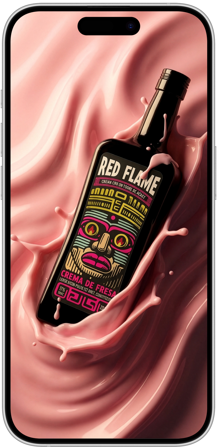
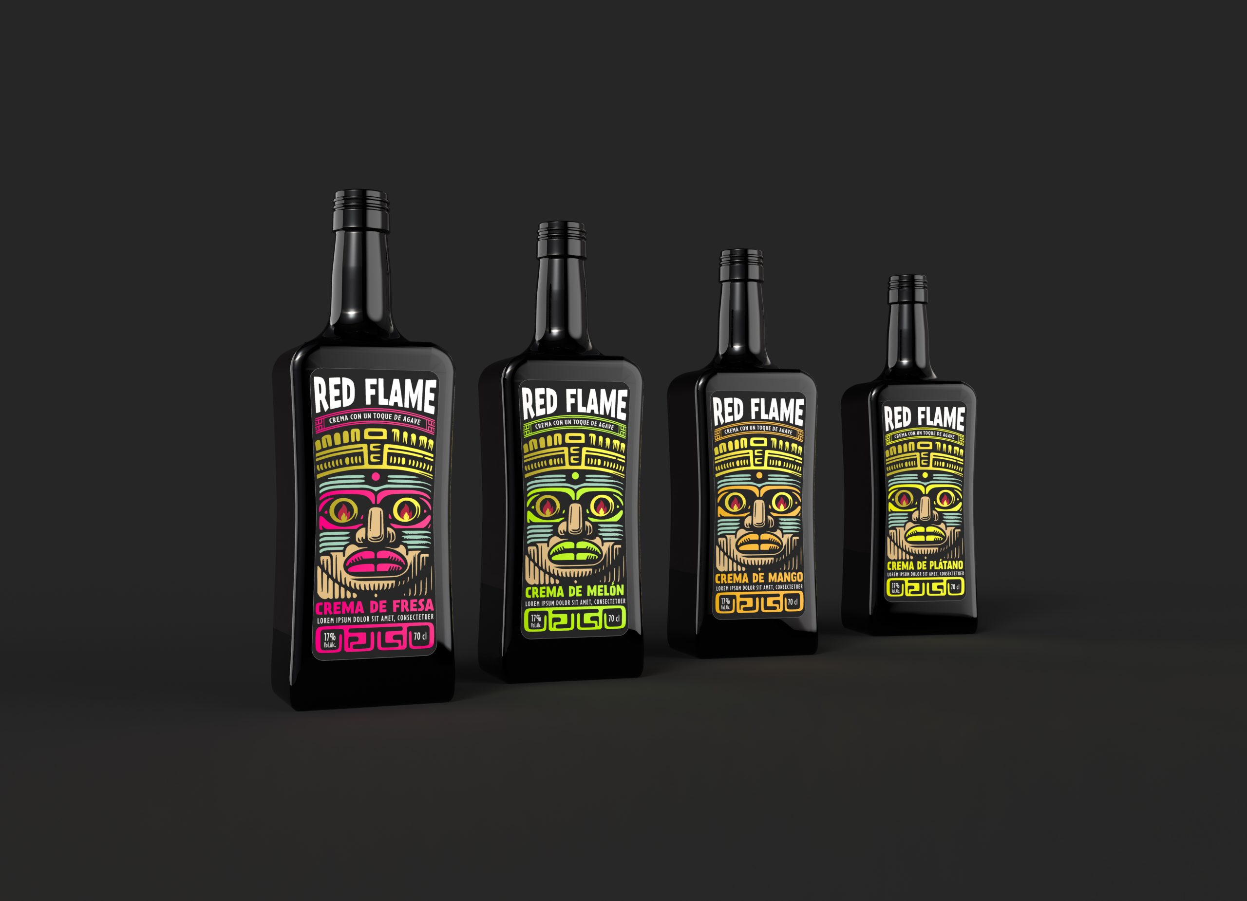
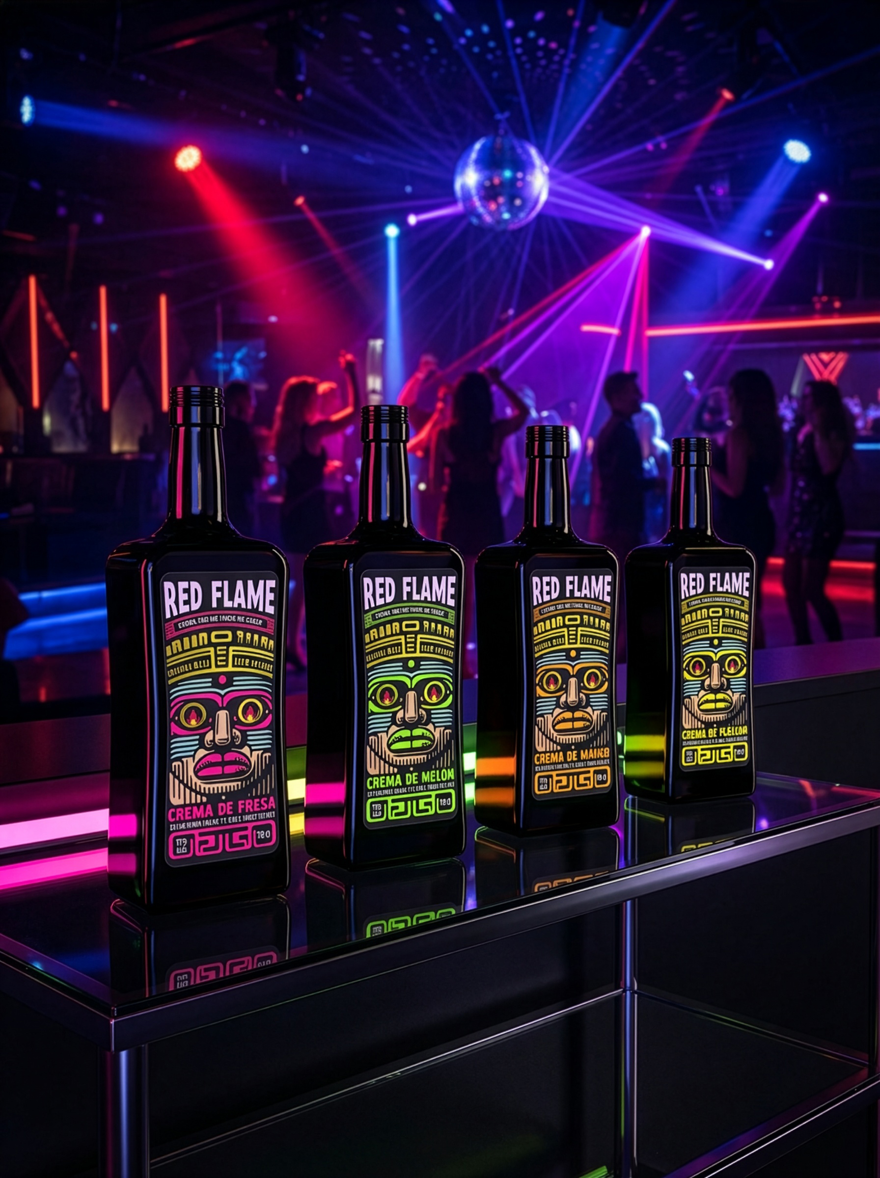
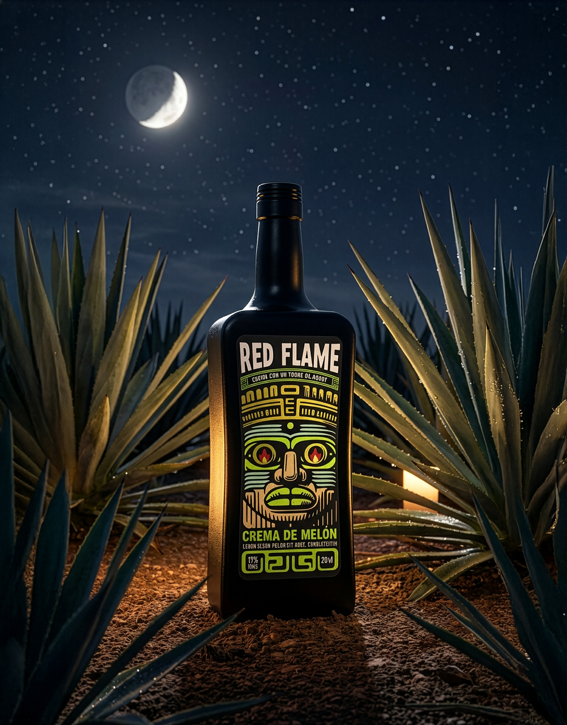
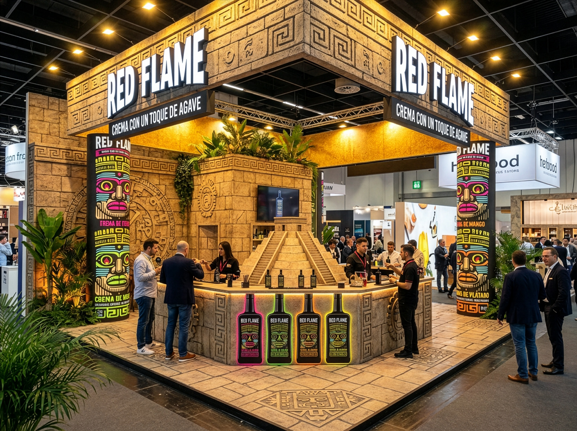
Contact
CABO4
C/ Tintorera, 9.
03540 Alicante, Spain
hola@cabo4.com
Ph: 865 721 161
June 15, 2019

RED FLAME

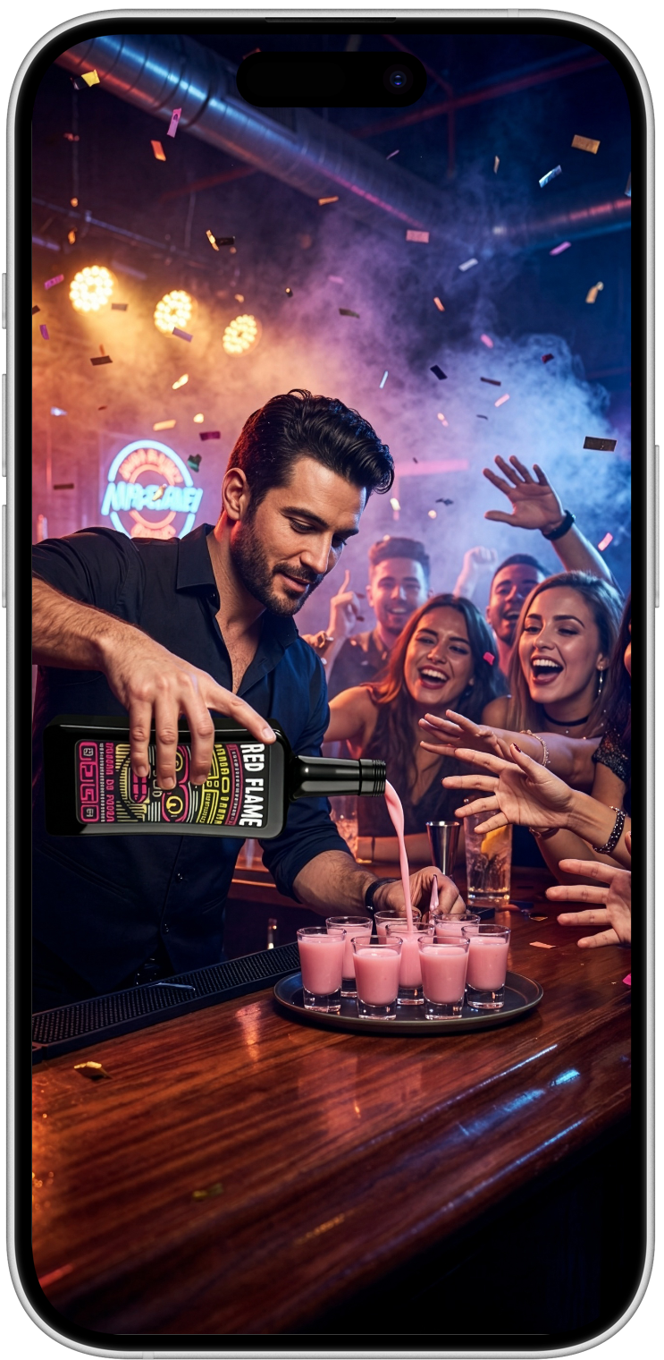
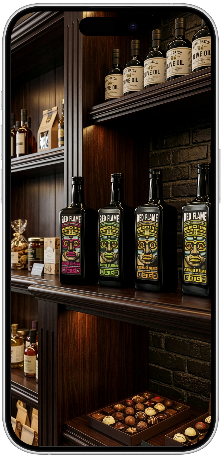
We created a powerful visual identity for Red Flame that reflects its bold character. From the label to the graphic language, we developed a design that not only stands out, but also clearly communicates its essence. A brand with a visual presence designed to sell.

Task

A liqueur with character, intense flavor, and strength. It needed a visual identity that could live up to it: striking, modern, and with personality.

  • Strategy

    Impacto Visual. Eficacia comercial

  • Design

    Imagen Renovada

  • Client

    Red Flame "Noara Company"

STARTING POINT

A powerful visual identity for a spirit with character and ambition.

Red Flame had power, personality, and a catchy name. It just needed a visual identity capable of supporting all that. We created a brand that speaks the same language: direct, recognizable, and designed to stand out.

RESULTS

An identity designed to stand out

We created a visual identity designed to stand out on the shelf, capture attention in seconds, and reinforce the character of the product, opting for an image that would project value, consistency, and commercial ambition.

ACTIVATE YOUR BRAND

You're just one email away from getting your brand moving.

We accompany you from the initial idea until the product is on the shelf, both in domestic and international markets.

    Back

    This website stores cookies on your computer. Cookie Policy